Park Chicago
An easy and convenient way of parking in Chicago.
I worked on the redesign of Park Chicago for a 10-week mentorship program through AIGA. This is the case study describing my process.
Roles I assumed:
Research • Wireframes • Visual Design • Hi-Fidelity Mockup
Project Goal:
Visual overhaul to reflect the brand.
Improve on the parking selection flow.
Adding a new exploration feature.
Defining the Problem:
As a regular user of the app, I felt that the app didn’t really do a good job selling that it was a Chicago parking app. The green and gray visuals are pretty generic looking. I wanted to bring some life into the app and make it more Chicago centric, by bringing in more imagery and giving the brand more of a Chicago aesthetic.
Current App
Research:
I first went on the app store to read the current users reviews and what the users thought were pros and cons.
From this I observed two trends. First, the majority were complaining about the number of clicks it took for them to complete the purchasing process. With this I wasn’t surprised, because I felt the same way as an active user of the app. Second, they complained that they had to preload $20 prior to using the app, which scared them away. One user specifically mentioned that she received a $50 ticket because she didn’t fully finish the purchase.
Next, I conducted a small user interview and asked a few of my fellow mentees a series of questions about their experience using the app.
What they liked about the app?
What they disliked?
Was it easy to purchase parking?
From my study, users were expecting a modern look and feel to the UI.
“It looks boring and not very modern”
The key issue was the purchasing flow and how many clicks it took to complete the purchase.
“Why so many clicks??”
A couple mentioned the hamburger menu was too busy and overwhelming.
Brainstorm/ Exploration:
After receiving the feedback, I went onto sketching out the new flow
New Flow Sketches
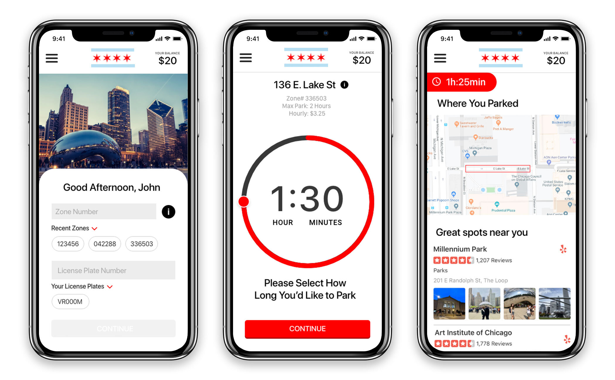
I wanted to shorten the parking selection to two screens addressing the concern about multiple clicks. The obvious choice was to merge Zone # and license plate to one screen and then have the next screen be time selection. Also, instead of having to use “up” “down” arrow control with increments of 1 min, I decided to have dial UI for the user be able to select the time to the minute.
I then decided to do some exploration for the menu. I explored the bottom nav. The bottom nav bar is very well adopted by modern app design and users are familiar with this UI pattern.
Bottom Nav Exploration
But, I ran into dilemma, most user who have been using this app have already adopted the hamburger menu. So, I decided to condense and include the most relevant info the user, which saves real-estate on the screen.
Hamburger Exploration
Wireframes:
After initial sketches. I reorganized the current content on the app which allowed easy access for the user to view the most relevant info. The current app interface is overloaded with information and lacks hierarchy, which in turn makes it difficult to navigate. My approach was to display the information that users finds most relevant when they login and have a clear path.
First time users would have to input zone # and their license plate manually initially. After their first use and dropdown arrow would appear to show the recent zones and your license plate, to reduce cognitive load. Then, once all the inputs have been selected the continue button then appears and user can continue with your purchase process.
I also, wanted to have the zone information present at the user's finger tips, by clicking the “i” icon, the zone info would smoothly slide down. Currently it is anchored to the bottom and crammed making difficult the read.
Finally, I wanted to incorporate an exploration feature, that would show the user nearby spots (bars, restaurants, and attractions) around them that they could check out. This would require integration with yelps api, which then would show yelps result specific to that area. I took it one step further to show the user where they parked and highlighted the zone.
Low Fidelity Mock-Up
Visual Design:
After prioritizing the the low-fi mock up, my next step was to define the brand visuals, typography, and color palette. I used Apple Human Interface Guidelines in order to develop a visual interface that would feel familiar and trustworthy. I then, settled on a few simple distinctions that would push the brand further.
A color palette that would emote Chicago
Beautiful lifestyle photo’s of the city
Rich and bold typeface
I began by establishing visual elements, color, typography, buttons. For the color palette, I took inspiration from the Chicago Flag. Red and Baby blue would be the primary and secondary colors.
I established “Red” as being the color that would trigger an action from the user or indicate once something was selected.
For how the imagery would be displayed, I was inspired by the Chase mobile app, each time you login the home screen changes based off your geo-location. I wanted to utilize this, since it would interesting way to visually show the user the location they are in.
Lifestyle Imagery
Finally, the typeface that I went with Brandon Grotesque Family. The lines and widths of it emote a geometric/ architectural feel, so I felt it was fitting.
Final Solution:
Here are the final screens, with new flow and updated visuals, I set out to create. Due to time restrictions, I solely focused on the iOS version of the app and went with SF font family.
High Fidelity Screens


